View Poll Results: Which layout is the best?


Multiple Choice Poll. Voters: 19. You may not vote on this poll
Your opinion please...
 9/29/08, 11:11 PM
#1
Legacy TMS Member
Thread Starter
I know this might be a strange place to be posting this but I'm taking opinions from all angles. I'm researching templates for a new web site to replace my old one. It's for my photography studio and it is mostly viewed and marketed to females, so use your feminine side. Which web site of the following do you like best:
A) http://www.davidsand.com/
B) http://goldenimagephoto.com/
C) http://artoflightphoto.com/
D) http://www.bigfolio.com/samples/cherry_lane/main.php
Remember you are not critiquing the photos or music, just the layout and function of each web site. Click on a few links and see how it feels to you. Thanks for taking the time in helping with my decisions. Please post any remarks good or bad.
Last edited by Ray Man; 9/29/08 at 11:13 PM.
 9/29/08, 11:30 PM
#4
Team Mustang Source
This is just me.... and it's hard to turn off the critical/techie side.
Sites that have flash or "loading" things just to bring up a page turn me off immediately. I usually cannot click the "skip" link/button fast enough. The web is at a stage now where it shouldn't be needed to wait for a page to load. The longer it takes to load the quicker you will lose a potential site visitor. The main page should be instantly viewable to the visitor. Also, forget which one, but the one that has the music off by default and is an option to turn on will be the one thanked by the people browsing from work.
As far as navigation A and D are the best, IMO
9/29/08, 11:45 PM
#5
Cobra Member

Join Date: November 15, 2007
Location: Torrance, CA
Posts: 1,460
Likes: 0
Received 0 Likes
on
0 Posts
I voted for C. It was the most feminine looking one for me. Gary, I agree, the first one came off really professional.
To me, loading time wasn't bad at all. More and more people are moving to DSL and cable so it shouldn't really be that big of a hit. I'm sure most clients of Ray are DSL and up users
To me, loading time wasn't bad at all. More and more people are moving to DSL and cable so it shouldn't really be that big of a hit. I'm sure most clients of Ray are DSL and up users
9/30/08, 12:48 AM
#6
Legacy TMS Member
Thread Starter
This is just me.... and it's hard to turn off the critical/techie side.
Sites that have flash or "loading" things just to bring up a page turn me off immediately. I usually cannot click the "skip" link/button fast enough. The web is at a stage now where it shouldn't be needed to wait for a page to load. The longer it takes to load the quicker you will lose a potential site visitor. The main page should be instantly viewable to the visitor. Also, forget which one, but the one that has the music off by default and is an option to turn on will be the one thanked by the people browsing from work.
As far as navigation A and D are the best, IMO
Sites that have flash or "loading" things just to bring up a page turn me off immediately. I usually cannot click the "skip" link/button fast enough. The web is at a stage now where it shouldn't be needed to wait for a page to load. The longer it takes to load the quicker you will lose a potential site visitor. The main page should be instantly viewable to the visitor. Also, forget which one, but the one that has the music off by default and is an option to turn on will be the one thanked by the people browsing from work.
As far as navigation A and D are the best, IMO
I voted for C. It was the most feminine looking one for me. Gary, I agree, the first one came off really professional.
To me, loading time wasn't bad at all. More and more people are moving to DSL and cable so it shouldn't really be that big of a hit. I'm sure most clients of Ray are DSL and up users
To me, loading time wasn't bad at all. More and more people are moving to DSL and cable so it shouldn't really be that big of a hit. I'm sure most clients of Ray are DSL and up users
9/30/08, 12:48 AM
#7
Legacy TMS Member
Join Date: May 24, 2006
Location: San Diego
Posts: 7,409
Likes: 0
Received 0 Likes
on
0 Posts
I voted for C. It was the most feminine looking one for me. Gary, I agree, the first one came off really professional.
To me, loading time wasn't bad at all. More and more people are moving to DSL and cable so it shouldn't really be that big of a hit. I'm sure most clients of Ray are DSL and up users
To me, loading time wasn't bad at all. More and more people are moving to DSL and cable so it shouldn't really be that big of a hit. I'm sure most clients of Ray are DSL and up users
9/30/08, 06:14 AM
#8
The Legacy TMS Lady
I vote C....from a feminine perspective. I also think that the first photo that loaded on each site had a lot to do with my choice. In C, the first photo really grabbed my attention. Everyone loves a beautiful bride, especially women. For D, the first opinion I had was that it was for a men's clothing site. The first, A, looked like a photographer that didn't specialize in wedding photography. I don't know if you specialize in wedding photography, but I assume if the site is geared toward women, than that would be your target market. I did not like the navigation on the left in B, it just didn't look classy enough.
9/30/08, 07:37 AM
#9

B gets my vote. 
9/30/08, 07:53 AM
#10
9/30/08, 08:43 AM
#12

I like the looks of B but prefer the navigation of D. So no offense ladies but after having to deal with showing my wife, mother and mother-in-law how to go through websites I have to go with D. Easier is better 
10/1/08, 12:15 AM
#13
Legacy TMS Member
Thread Starter
Interesting responses, thanks you guys. It is helping me formulate a custom look and feel for my new web site.
Anybody else out there have any opinions?
Anybody else out there have any opinions?
10/1/08, 10:39 AM
#14
I like A or B but D seems ok for black & white & C has that catchy tune , I think that the Ladies may like A but B seems more open to like a Welcome, Now if I had seen your car in one in may have been a biast opinion.
10/1/08, 02:43 PM
#16
Cobra Member
This is just me.... and it's hard to turn off the critical/techie side.
Sites that have flash or "loading" things just to bring up a page turn me off immediately. I usually cannot click the "skip" link/button fast enough. The web is at a stage now where it shouldn't be needed to wait for a page to load. The longer it takes to load the quicker you will lose a potential site visitor. The main page should be instantly viewable to the visitor. Also, forget which one, but the one that has the music off by default and is an option to turn on will be the one thanked by the people browsing from work.
As far as navigation A and D are the best, IMO
Sites that have flash or "loading" things just to bring up a page turn me off immediately. I usually cannot click the "skip" link/button fast enough. The web is at a stage now where it shouldn't be needed to wait for a page to load. The longer it takes to load the quicker you will lose a potential site visitor. The main page should be instantly viewable to the visitor. Also, forget which one, but the one that has the music off by default and is an option to turn on will be the one thanked by the people browsing from work.
As far as navigation A and D are the best, IMO
I agree with this wholeheartedly! Flash is okay when used in moderation, but not as the whole site IMO... You are immediately turning off anyone with a slow connection speed... I am on a decent connection and they loaded pretty quickly, but what if your customer is still on 56K? Pictures in general are going to take a while to load anyway, why bog that down with a slow (heavy) site as well? Plus, with flash sites, the indexing from Google and Yahoo doesn't see all the individual pages in the site, only the main page... So your site also loads slowly into the searchable databases and potentially doesn't list as high when people do searches... Just something to think about...
And I agree with the music, I always do mine with 'off' as the default and 'on' as an option...
If just given the choices above, I like 'D' the most...
 10/7/08, 12:35 AM
#19
Mach 1 Member
Join Date: November 11, 2004
Location: South Georgia
Posts: 900
Likes: 0
Received 0 Likes
on
0 Posts
I've made a few web sites myself, and I love photography, so this is right up my alley.
I agree with the music being default as muted. I also like that you'll be doing the site in both flash and a basic format for slow connections. It will definitely help search engines pick up your web site content quicker. I would also say to keep it as simple as you can when it comes to navigation, clicking instead of hovering to show more nav menus usually ends up working better for users using different browsers. I would also limit the amount of pictures in each category, whether 20 or 30, that's just a magic number. There's a balance between too many pictures and too little. You want just enough so that it shows off your broad range of capability and artistry, but not so much that people are going 'it seems like he takes the same shot just with different people.'
Definitely provide an email and a starting price for your different 'packages.' When I was looking for our wedding photographer earlier this year I would have to email the photographer not knowing any idea of what kind of price range he was going to quote me in. When you're planning something as stressful as a wedding, you don't want to have to waste your time emailing 10 photographers who are out of your price range when they could've easily just listed a starting price for even just their basic package.
BTW, I always found it neat to see a bio of the photographer/staff with their pictures and a limited history about them and their interest in photography. It's nice to see the person behind the camera of all of the wonderful pictures you've just seen.
Hope this helps.
10/9/08, 12:05 AM
#20
Legacy TMS Member
Thread Starter
Thanks Brandon, those are great suggestions!
Alright guys & gals, here's what I think is an awesome design of a site (especially the home page). I'm not really fond of the background artwork but that is easily changed. I guess I just really like the tiling animation on the front page.
http://www.regeti.net/
And here is a rough draft for my new home page with the tiling animation in mind. Opinions are welcome and greatly appreciated! Click on some of the links and see how they work.
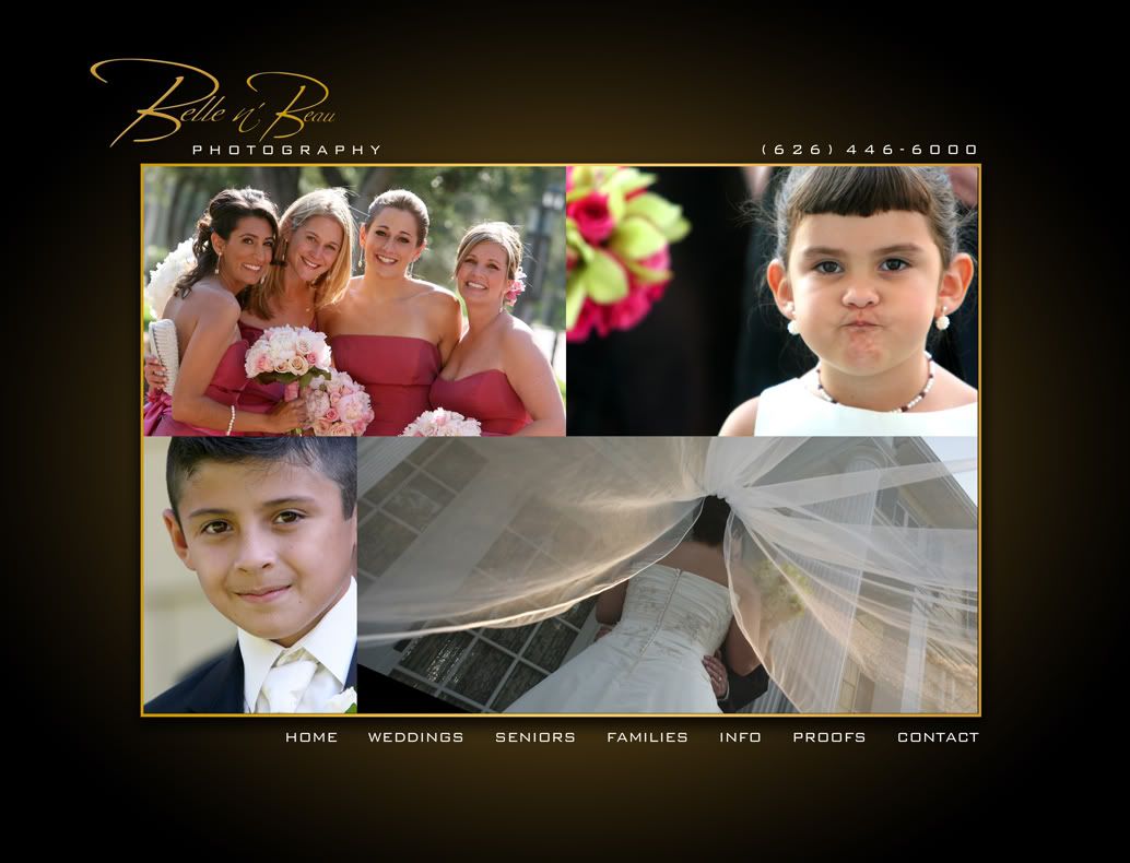

Thread
Thread Starter
Forum
Replies
Last Post
tj@steeda
'10-14 V6 Modifications
1
9/23/15 03:21 PM