2014 Gauge Change


Cobra Member

Joined: January 4, 2013
Posts: 1,418
Likes: 119
From: Frisco, TX
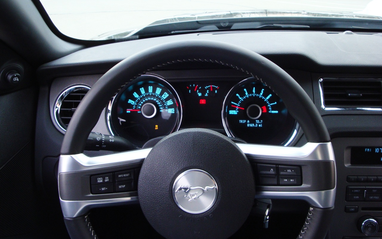
I like the 2014 better. It seems to me that moving the tachometer has marks to the outside of the needle sweep area gives you a slightly more precise read on RPMs - not that it makes a big difference. Removing the 'intermediate' speed numbers (30, 50, etc.) makes the speedometer less cluttered looking.

Cobra R Member
Joined: September 26, 2007
Posts: 1,931
Likes: 0
From: Massachusetts
I think the 2014 speedometers is less busy but I hope Ford ditches the retro font on the next Gen car. I think reading the speedometers on the GT500 and boss is so much clearer!

GTR Member
Joined: October 18, 2006
Posts: 5,553
Likes: 11
From: England
Nice catch, TN.
I prefer the '14 dials (although there's not much in it) simply for the more easy to read speedometer.
Does the '14 still have the "halo" on the dials though? It's pretty obvious in the photo of the '13, not so in the photo of the '14.
I know MyColor is a gimmick, but I thought the additional halo on the '13 was a cool move by Ford

GT Member
Joined: November 16, 2012
Posts: 136
Likes: 0
From: Maine
Personally, I'm still in love with the retro. It's the whole reason I decided not to wait for the '15 car. That said, I think I like the '13 slightly better, and I have a '14 on order.
GT Member
Joined: December 27, 2012
Posts: 191
Likes: 2
From: Charlotte, NC
I went from a 13 to a 14 and instantly noticed the gauge change and I really like the 14 better during the day and at night. It's clean.
edit: Also people are saying they can hear me much clearer on Bluetooth phone. So I guess the mic on my 13 wasn't nearly as good as this. I'm really glad too because I dislike repeating myself.
Team Mustang Source
Joined: January 15, 2005
Posts: 1,424
Likes: 0
From: So. FL
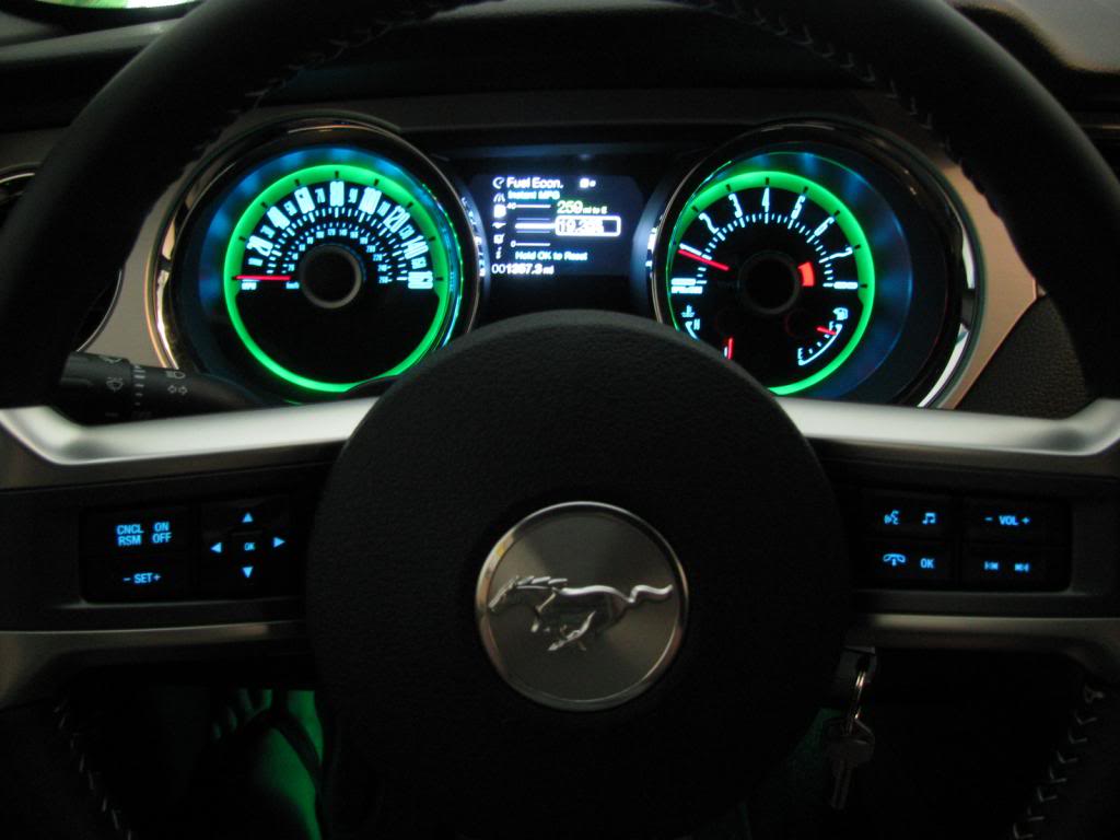
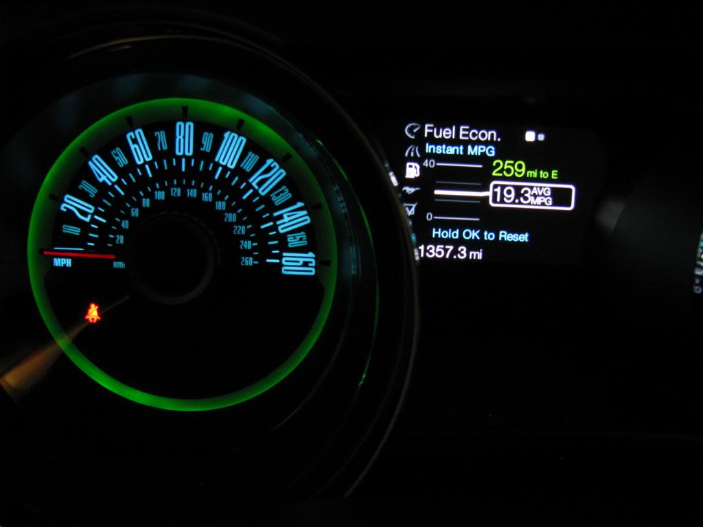
IMO, the guages on the 2013 look better at night, especially the halo portion. I have my halos set to green, like my door sills and ambient lighting, while keeping the rest of the guages blue like the rest of the lighting inside the car, including the radio, etc. ..looks so sharp! I doubt that the halo feature will look so good on the 2014 guages, as they don't have the distinct border that the 2013 guages have. Below are a couple photos of my guages lit up at night, so you guys can see what I'm taking about. Maybe someone with a 2014 can try the same.
Last edited by SoFlaBoss; Feb 23, 2013 at 06:25 PM.