
Photoshopping
 8/29/07 | 07:44 AM
#2
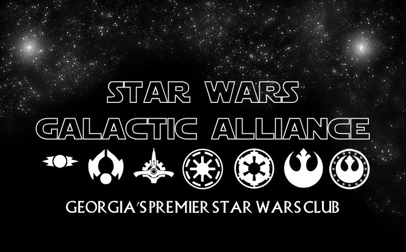
Not a big SW fan, but cool idea with all the symbols (I'm guessing they are all from the movies)
I would put a space between Georgia's and Premier.
I would put a space between Georgia's and Premier.
8/29/07 | 08:22 AM
#3
Thread Starter
Bullitt Member
Joined: July 29, 2005
Posts: 494
Likes: 1
From: Atlanta GA
There is a space there, and I tried with two and it just looked like a monstrous gap there.
The symbols are: Old Old Republic, Old Republic, Galactic Senate, Republic 'Cog', Imperial 'Cog', Rebellion, New Republic
The symbols are: Old Old Republic, Old Republic, Galactic Senate, Republic 'Cog', Imperial 'Cog', Rebellion, New Republic
8/29/07 | 09:07 AM
#4
Then what you might do is make the Georgia's into a serpate layer than everything else and move that layer over manually just a tad to make it look like theres a space there. To me it just looks run together with those 2 particular words.
8/29/07 | 12:57 PM
#6
Cobra R Member
Joined: September 26, 2006
Posts: 2,019
Likes: 5
From: East Moline, IL
I concur as well. I have to do that when I use the Nokia font to write Mustang. For some reason, the T&A run together (T & A? Imagine that.), so I have to use two layers, position it, then merge them.

Thread
Thread Starter
Forum
Replies
Last Post
428CJ
Testing, Help, Site Feedback and Suggestions
13
5/30/04 04:30 PM