
Looking for some creative ideas on creating a website logo
 4/25/08, 02:54 PM
#1
Tasca Super Boss 429 Member
Thread Starter
Looking for some creative ideas on creating a website logo
I run a website called magazinesinthemail.com, which sells yearly subscriptions to all sorts of magazines, and have been doing so for several years. Business has been slow lately and i'm looking to get it hopping again so it can help support my new Mustang habit!
One thing the website has lacked is a logo. I've pretty much just used text stating the website name.
Since I lack the talent to design a logo, and the creativity to come with an idea for one, I had a logo creating company to come up with something for me.
They didn't do too bad with a few of their ideas, but nothing really stands out to me.
Posted below are samples of what they have come up with. I'd like to hear from the creative and even non-creative people here on what they think. I'm open to both the positive and negative, as well as any edits to add new ideas to what currently exists.
Here are the samples:
The first one here I really don't like:

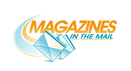
This one is probably the better one of them all, but just not enuff of something...
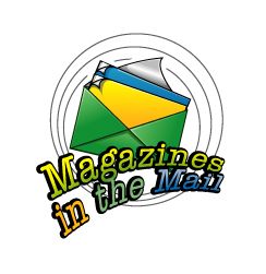
This one is so-so, and has envelopes. Should be magazines.
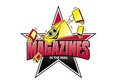
Is that Sponge Bob?
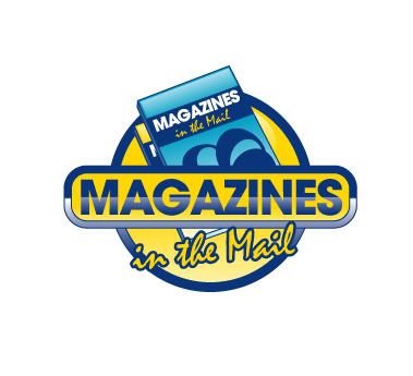
This may have possibilities... combine it with the 2nd one?
Thats what i've got. I look forward to hearing some of your ideas!
One thing the website has lacked is a logo. I've pretty much just used text stating the website name.
Since I lack the talent to design a logo, and the creativity to come with an idea for one, I had a logo creating company to come up with something for me.
They didn't do too bad with a few of their ideas, but nothing really stands out to me.
Posted below are samples of what they have come up with. I'd like to hear from the creative and even non-creative people here on what they think. I'm open to both the positive and negative, as well as any edits to add new ideas to what currently exists.
Here are the samples:
The first one here I really don't like:
This one is probably the better one of them all, but just not enuff of something...
This one is so-so, and has envelopes. Should be magazines.
Is that Sponge Bob?
This may have possibilities... combine it with the 2nd one?
Thats what i've got. I look forward to hearing some of your ideas!
 4/25/08, 03:25 PM
#2
Cobra R Member
Join Date: September 26, 2006
Location: East Moline, IL
Posts: 2,019
Likes: 0
Received 5 Likes
on
4 Posts
Did those come from these guys? I've heard good things about them.
http://thelogocompany.net/
I think #3 is promising, with magazines in place of the envelopes. It's clean and professional.
http://thelogocompany.net/
I think #3 is promising, with magazines in place of the envelopes. It's clean and professional.
4/25/08, 03:46 PM
#3
Tasca Super Boss 429 Member
Thread Starter
Yup, it came from them. I haven't heard anything about them but their portfolio looks pretty good so i decided to give them a try.
The 3rd is more professional, but simple. I'm looking for a bit more eye catching. I'm leaning more towards the bottom one as a base and work on changes from there. Hopefully I can pull a few ideas from the people here. Someone may have a better idea for one of the others as well.
The 3rd is more professional, but simple. I'm looking for a bit more eye catching. I'm leaning more towards the bottom one as a base and work on changes from there. Hopefully I can pull a few ideas from the people here. Someone may have a better idea for one of the others as well.
4/28/08, 09:05 AM
#5
Cobra R Member
Join Date: September 26, 2006
Location: East Moline, IL
Posts: 2,019
Likes: 0
Received 5 Likes
on
4 Posts
If you describe what you want, I can make it. You want to start with the last one and work from there, but what changes are you wanting? Give me an idea and I'll make it happen for you.
4/28/08, 10:05 AM
#6
Tasca Super Boss 429 Member
Thread Starter
It's already in the process of being made, so that's not an issue. I was just looking to see if anyone had a good imagination with ideas that could make any of these better.
My imagination level is about zero when it comes to this stuff, and by the response, so is everyone elses!
My imagination level is about zero when it comes to this stuff, and by the response, so is everyone elses!

 4/28/08, 02:14 PM
#10
Cobra Member
Perfect! on the flag. I'm not feeling the 'IN THE' where it is... I know it's not my company or logo, but in my opinion it throws the balance off and my eyes gravitate to just that. Did you try it to the right of the 'flag' under 'nes' in black and not 'stretched' just a fixed height for all of them?
Mad skillz dude!
-danny
Mad skillz dude!
-danny
4/28/08, 02:42 PM
#11
Tasca Super Boss 429 Member
Thread Starter
I like the idea of using the flag as part of the letter "I", but it also looks like an exclamation point. It's a not a bad thing, but Magazines.com uses that. They are a big company, i'm just a mom and pop type store. Can't steal their style.
Please keep in mind I do have a paid company working on this, so don't spend a lot of time on the graphics part unless it is something you really enjoy. While I was just looking for verbal ideas, you bringing it to life is above and beyond what I expected to see from anyone. THANK YOU!
Please keep in mind I do have a paid company working on this, so don't spend a lot of time on the graphics part unless it is something you really enjoy. While I was just looking for verbal ideas, you bringing it to life is above and beyond what I expected to see from anyone. THANK YOU!
4/28/08, 04:02 PM
#13
Tasca Super Boss 429 Member
Thread Starter
I'm thinking something with using these two with the top one being the main design. Take the word 'magazines' in the current font and give it 'speed' like the second one and add DarkFires swooshes coming into it. Lose the magazines on the top and replace it with a mailbox. Could be a mailbox itself with magazines hanging out of it, or a character getting them from the mailbox. I like the idea of using the mailbox flag as a letter in a word, but seems kinda hard to add in the way i'm thinking.
Yes? No?
Yes? No?
4/28/08, 04:22 PM
#14
Cobra R Member
Join Date: September 26, 2006
Location: East Moline, IL
Posts: 2,019
Likes: 0
Received 5 Likes
on
4 Posts
I'll see what I can do. Check back in half hour. Better make it an hour or so... I have another client on the way to the house now.
Last edited by DarkFireGT; 4/28/08 at 04:32 PM.
 4/28/08, 06:28 PM
#16
Tasca Super Boss 429 Member
Thread Starter
I sit here giggling... in a good way. That's pretty close!
I like your original swoosh better, use that and move it up to the same line where MAGAZINES is.
Now, try moving the mailbox up a bit and put it on a post. Part of the post should be visible above the word MAGAZINES, run behind it, and visible a bit below. Maybe some blades of grass at the bottom of the post. Post should also be on an angle, about the same angle as the letter A in magazines. Use your best on placements if mine seems off. Don't rush for tonight as I may not see it until tomorrow anyway.
I still need to contact the logo people and see what they can do for a re-vamp without telling them when you have come up with so far. I will see what they come up with and try mixing and matching ideas from there.
You have really surprised me and the outcome of this has been much better than anticipated.
PM me a list of your favorite car magazines or any others you may like and i'll see what kind of package I can put together for you FREE as a way of saying thanks for helping me out with this.
4/28/08, 06:50 PM
#17
Cobra R Member
Join Date: September 26, 2006
Location: East Moline, IL
Posts: 2,019
Likes: 0
Received 5 Likes
on
4 Posts
I did this while you were waiting. I like this one a lot better. Where do you want to swoosh to start and end?
And, of course, high res versions will be available for you if you decide to go with my version.

Here's one with no swoosh:

And, of course, high res versions will be available for you if you decide to go with my version.
Here's one with no swoosh:
Last edited by DarkFireGT; 4/28/08 at 07:05 PM.
4/28/08, 07:23 PM
#18
Tasca Super Boss 429 Member
Thread Starter
Not sure about that mailbox. I think the receiving end would work better, not the sending end.
Anyone else lurking and watching these posts? Feel free to jump in with comments!
Anyone else lurking and watching these posts? Feel free to jump in with comments!
4/28/08, 07:32 PM
#19
Tasca Super Boss 429 Member
I don't think the "in the mail" should be cursive writing style. I think it is harder to read.
I think the mailbox should be receiving ,not mailing type.
That's just what I think.
I think the mailbox should be receiving ,not mailing type.
That's just what I think.
4/29/08, 02:34 AM
#20
Tasca Super Boss 429 Member
Thread Starter
I've been thinking about the script lettering myself. The "I" in "IN" seems to get lost.
Thats a change I will make, but i'll wait a bit and see what happens to the design and get the lettering to fit to it.
Thats a change I will make, but i'll wait a bit and see what happens to the design and get the lettering to fit to it.