When you click on links to various merchants on this site and make a purchase, this can result in this site earning a commission. Affiliate programs and affiliations include, but are not limited to, the eBay Partner Network.
honestly after trying it the old style is better IMO, too much on the white borders, and the text area that supposed to be a grey color, it blends in too much with the white borders so its some times hard to determine where things are...please fix it, I think I will be switching back to the old layout, it at lease was working correctly....
Oh and please stop breaking the old layout just to force people to change...its quite irritating...
Hey, nobody has to try to break the old layout. It breaks itself. One of the reasons for you to make the switch!
So are you going to fix the link glitch on the e-mail notices any day soon or has that been stopped on purpose?
What do you mean by link glitch on the e-mail notices? What's the glitch? And are you referring to the thread subscription emails and PM notifications?
What do you mean by link glitch on the e-mail notices? What's the glitch? And are you referring to the thread subscription emails and PM notifications?
I am referring to the thread subscription notices. There used to be a link we could click on to go right to the thread. Since the update, it has become just a text string.
New format is OK. One beef I have is with the new format you cant load an individual page in a thread like you can in the old one, so now you have to open a thread then go to the last page instead of just opening the last (latest) page. 1 click, wait for thread to load, 2nd click to go to the last page, i.e,. my destination. I work in Healthcare IT, and now understand "click counting" health care providers LOL.
Last edited by MADSCOTSMAN; May 6, 2016 at 11:33 AM.
New format is OK. One beef I have is with the new format you cant load an individual page in a thread like you can in the old one, so now you have to open a thread then go to the last page instead of just opening the last (latest) page. 1 click, wait for thread to load, 2nd click to go to the last page, i.e,. my destination. I work in Healthcare IT, and now understand "click counting" health care providers LOL.
Hah, I'm in the same field. When I talked to the IB folks, they asked if I used the page selector buttons - I didn't realize how much I did in fact use them!
Hey, nobody has to try to break the old layout. It breaks itself. One of the reasons for you to make the switch!
Well I am liking the new style, BUT PLEASE can you at least make the white borders blend LESS with the white/light colored areas where text is? that is what I find irritating really, also I too use the page buttons, and I think having them look the same as the old layout but more modern styling (not sure how to really explain this part) would be good too!!
I have done a lot of Webdesign back in my high school days and that was the first thing I made sure I would do is ensure any forums I made were designed with flat panle displays in mind (this was back when LCD was the big thing before the LED displays started coming out)
Last edited by Jim74656; May 14, 2016 at 02:25 PM.
I tried the new look for a good 1-2 weeks, ended up going back to the old design.
I hated not having a "User CP" button, I hated clicking on a thread and not automatically going to the last page cuz there was no "Last Page" link to click on, and the Thread Tools being hidden under that asterisk-looking thing, off to the left when it used to be on the right side of the page, .... too much change for the sake of change
So anyone notice the latest changes to Next Gen!? Pretty proud of the latest look and you know how I was saying that we wouldn't be offended with feedback? We're going to be offended now.
Just kidding! Let us know what you think. Here's a preview:
So anyone notice the latest changes to Next Gen!? Pretty proud of the latest look and you know how I was saying that we wouldn't be offended with feedback? We're going to be offended now.
Just kidding! Let us know what you think. Here's a preview:
That's kinda funny that you post a screenshot of my post complaining about the missing "User CP" button and Thread tools missing, boast about how you've made great new changes, but all that stuff is still missing:
Oh, and by the way, I really wish the thumbnail for an uploaded attachment was just that, a thumbnail, not a half-the-size-of-the-screen attachment, which is too large to be a thumbnail and too small to be a picture easy to see, so you have to click on it anyway.
Uploads/attachments should be displayed as a small thumbnail.
Sorry,but please don,t discard the old format.Besides, it took me over, all toll,45 minutes just to get on here .I was ready to say ' ----it'. Went through my 5 tries and still had to wait my 15 mins. New p/w and all. Yikes
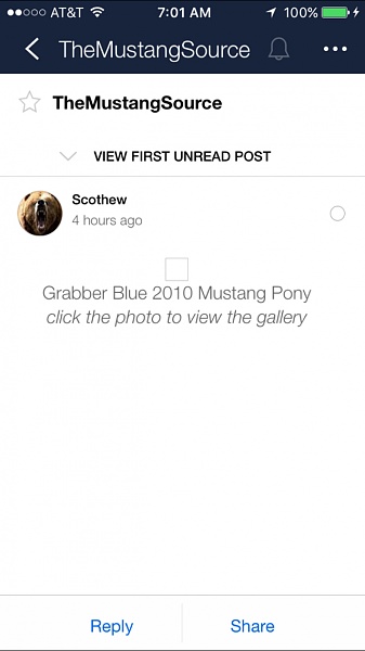
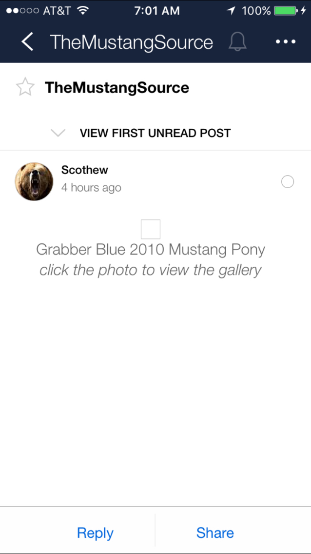
This BS on the mobile app! I have some really cool pics for you to see so I make a new thread. Then after opening the thread.
There is this little box that appears. After clicking on it it takes you to a useless page that doesn't get you to the pics! Frustrating as fark!
Last edited by Mustang Freak; Sep 5, 2016 at 05:09 AM.