Sketching up some Valve Cover Graphics ideas
 1/27/15, 08:15 PM
#1
Legacy TMS Member
Thread Starter
Sketching up some Valve Cover Graphics ideas
I'm not sure if this counts as an exterior mod...it's not really the outside of the car, but it's not the interior either. Anyway-- I'm looking at doing some custom painted valve covers for my car, so I started sketching up some quick graphics.
I'm considering 2 colors for the covers, Ford Racing Blue or Gray (to closer match my Tungsten GT). At this point, not sure if the graphics would be white, silver, or exposed aluminum.
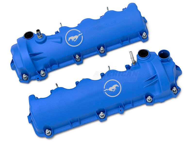
As for the Pony logos, they may seem like they're in an odd place, but I picked that for maximum visibility amongst the wiring harness, vacuum hoses, and A/C lines. And, just like the pony fender badges, one is a mirror image so the horse is facing the front of the car on each side.
First up, Ford Racing Blue:
#1 Simple Racing stripes

#2 Simple Pony Logo
#3 Combo of 1 and 2

#4 Version of 3, with gear teeth on the inside ring. Kind of mimics the subwoofer rings in the doors, which ties it in a little bit with the car (also resembles S197Forum's new logo))

#5 Alternate #4, with gear teeth on the outside of the ring

I'm considering 2 colors for the covers, Ford Racing Blue or Gray (to closer match my Tungsten GT). At this point, not sure if the graphics would be white, silver, or exposed aluminum.
As for the Pony logos, they may seem like they're in an odd place, but I picked that for maximum visibility amongst the wiring harness, vacuum hoses, and A/C lines. And, just like the pony fender badges, one is a mirror image so the horse is facing the front of the car on each side.
First up, Ford Racing Blue:
#1 Simple Racing stripes
#2 Simple Pony Logo
#3 Combo of 1 and 2
#4 Version of 3, with gear teeth on the inside ring. Kind of mimics the subwoofer rings in the doors, which ties it in a little bit with the car (also resembles S197Forum's new logo))
#5 Alternate #4, with gear teeth on the outside of the ring
 1/27/15, 08:25 PM
#2
Legacy TMS Member
Thread Starter
And now for gray. The idea for these would be to tie them in with the overall color palette of the car:

They wouldn't be Tungsten, since that paint looks pretty dull under the hood. The valve covers would be matte gray, like this:
#5

#6

#7

#8

#9

They wouldn't be Tungsten, since that paint looks pretty dull under the hood. The valve covers would be matte gray, like this:
#5
#6
#7
#8
#9
1/27/15, 08:27 PM
#3
Legacy TMS Member
Thread Starter
So, any votes, suggestions, etc? I'm definitely open to other designs. Just want to keep it a clean design (no carbon hydrodipping, skulls, overly complex graphics, etc)
1/27/15, 11:07 PM
#4
Post *****
Join Date: December 14, 2007
Location: State of Jefferson Mountains USA
Posts: 20,005
Likes: 0
Received 4 Likes
on
4 Posts
The bummer is they are hard to see. So the stripes might get you more visual bang if that's what you want.
.
.
Last edited by cdynaco; 1/28/15 at 05:36 PM.
 1/28/15, 05:46 AM
#6
FR500 Member
[QUOTE=cdynaco;6892964]They bummer is they are hard to see. So the stripes might get you more visual bang if that's what you want.
I agree.
Have you considered reversing the scheme...silver covers with gray stripes? That might brighten up the engine bay a bit.
I agree.
Have you considered reversing the scheme...silver covers with gray stripes? That might brighten up the engine bay a bit.
1/28/15, 06:58 AM
#7
Legacy TMS Member
ran across these last night. They might look alright on valve covers somewhere
http://www.ebay.com/itm/301501898347?_trksid=p2055119.m1438.l2649&ssPageName=STRK%3AMEBIDX%3AIT
http://www.ebay.com/itm/301501898347?_trksid=p2055119.m1438.l2649&ssPageName=STRK%3AMEBIDX%3AIT
1/28/15, 05:19 PM
#8
Legacy TMS Member
Thread Starter
[QUOTE=TripleBlack14;6892984]
Hadn't considered it, no -- but pretty easy to mock up:

I was also thinking about adding the BOSS STB and Ford intake cover, similar to this guy's setup, which would definitely brighten things up:

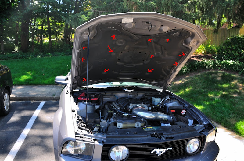
And I have a polished aluminum intake already (ignore the arrows--that was for a washer jet relo walkthru I never posted)
Hadn't considered it, no -- but pretty easy to mock up:
I was also thinking about adding the BOSS STB and Ford intake cover, similar to this guy's setup, which would definitely brighten things up:
And I have a polished aluminum intake already (ignore the arrows--that was for a washer jet relo walkthru I never posted)
1/28/15, 05:30 PM
#9
Legacy TMS Member
Thread Starter
I did a quick photochop --excuse the crappy quality --and grime:

So you'd be able to see some of it at least...
Unless I did a wire tuck (ainna gonna happen):

 1/28/15, 05:36 PM
#11
Legacy TMS Member
Thread Starter
Plus...I don't actually have any Ford Racing parts on the car. I've got Steeda, BMR, Granatelli, QA1, Shelby, Koni...oh wait. My 3.73's are FR
1/29/15, 06:53 PM
#12
Legacy TMS Member
Totally agree. That's definitely part of the reason I'm not going to town on these and sticking with simple. I like the idea of doing the stripes w/ Pony logo --your eye picks up the stripes right away and then catches the logo detail on a 2nd read.
I did a quick photochop --excuse the crappy quality --and grime:
So you'd be able to see some of it at least...
Unless I did a wire tuck (ainna gonna happen):
I did a quick photochop --excuse the crappy quality --and grime:
So you'd be able to see some of it at least...
Unless I did a wire tuck (ainna gonna happen):
1/29/15, 08:17 PM
#13
Post *****
Join Date: December 14, 2007
Location: State of Jefferson Mountains USA
Posts: 20,005
Likes: 0
Received 4 Likes
on
4 Posts
Shame on Ford.  They used to take pride in their engine appearance particularly cam and valve covers.
.

.
vs:
They used to take pride in their engine appearance particularly cam and valve covers..
.
vs:

Last edited by cdynaco; 1/29/15 at 08:18 PM.
